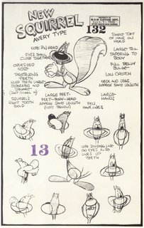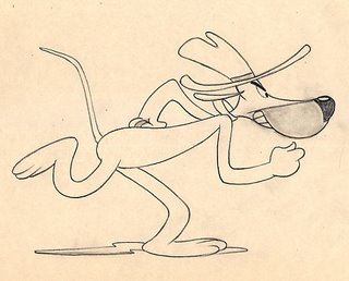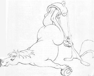
Here's a couple of model sheets and animation drawings from Tex Avery's "Screwy Truant", "Happy Go Nutty" and "Lonesome Lenny". Screwy was slightly redesigned for these shorts giving him a goofier, less cute look. Particularly the smaller cranium. Personally, I think he looks a bit ratty. But it's very fitting. I'm not sure who designed him this way but I'm assuming it was Claude Smith as he was drawing a lot of the models at this time including the original character design, which I posted here a couple of months ago. I've said it before I think he's the perfect character for a Tex Avery cartoon. He's just as unpredictable as Avery's gags. My personal favorite along with early Bugs and Daffy. I've been spending a lot of time practicing drawing him from model sheets and you can see my feeble attempts here. Feel free to let me how I've screwed him up.


Hey Kevin,
ReplyDeleteThanks for posting all this great inspirational stuff! I like the second to the last drawing, where Screwy is twisted in the middle. That's a difficult pose to copy!
Yes! Thanks for posting these up! personally I like this design better than the other cuz its just so gosh darned cartoony. The construction is real intresting too, hes cranuim is somewhere between oval and banna shaped
ReplyDeleteI also thought you might be intrested in this-->http://www.screenarchives.com/title_detail.cfm?ID=6436 its a collection of Scott Bradley's music from Tom & Jerry and Tex Avery cartoons! Only 3,000 copies were made so I bought mine like an hour ago. I plan to use some of that music for practicing timing to animation whenever Im going to start animating.
Glad you guys like the post.
ReplyDeleteGabe, I ordered mine yesterday. I can't wait. I have the CD of Tex Avery soundtracks but it has some dialouge and sound FX in it. I'm really looking forward to this set and the liner notes by Daniel Goldmark. Scott Bradley is the greatest, I've spent far too much time extracting the audio from my DVDs just to get the music.
Oh man!! Such great drawings!!
ReplyDeleteI particularly love the horse!
Great post as always Kevin :) :)
very cool
ReplyDeleteNot to take anything away from these shorts, cause i love anything Avery, but what was up with their "poster" department?
ReplyDeleteThe posters to these shorts were horrible. Bad fonts, drawing and colouring. Did they not care or was it a money thing?